Printmore- Printing Flowers, Choosing Color, and Getting Critical
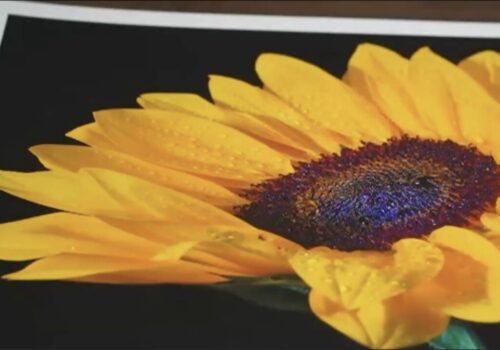
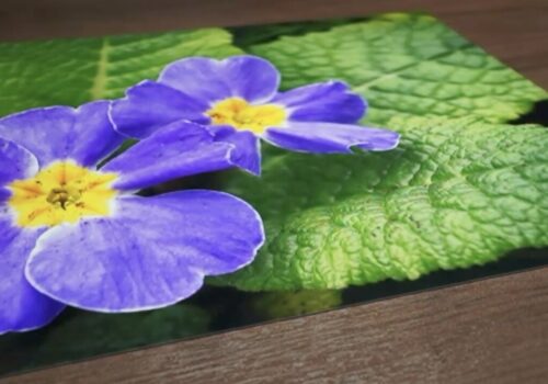
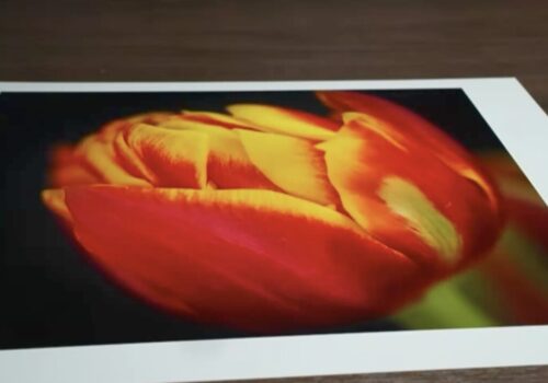
This past week, I had the delight of printing the work of 8 different photographers for our monthly Print Review class, “Printing Flowers”. I chose this topic for a printing class because I thought, “Who wouldn’t want a beautiful print of a flower on their wall?!” We discussed a variety of topics, from editing and soft proofing your color to paper surfaces and how it affects the mood and result of your print. I have three takeaways that I would like to share.
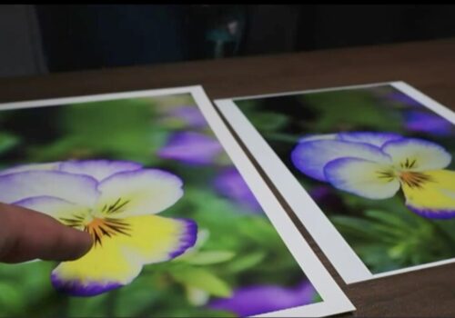
Don’t over-edit your work.
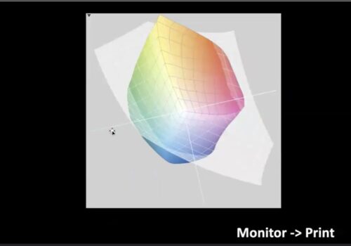
We spent a good deal discussing soft proofing, which is all about being able to preview the color accuracy in your print, and what are flowers if not a beautiful variety of vibrant colors! While increased saturation and contrast may give images that extra pop on your monitor, physical printing contains so much more detail and dynamic range, and over-saturation and contrast can ultimately lead to a lack of detail.
Don’t be (overly) satisfied.
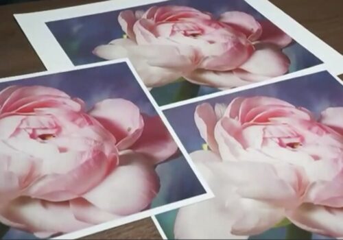
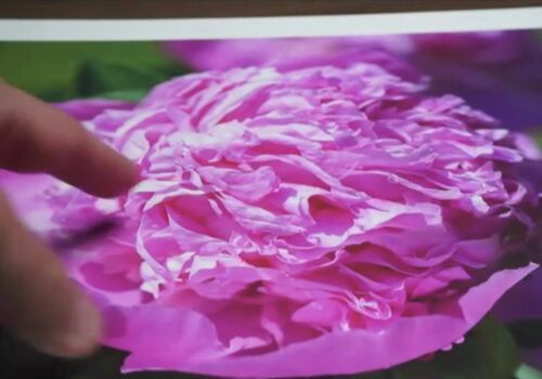
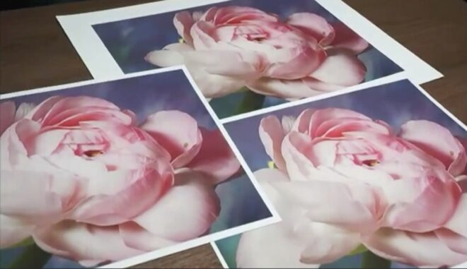
In my print classes, we try to nail the perfect print the first time around. In my personal experience, that’s rarely how it goes because I strive to make the best print possible. I encourage this of my attendees, as I never want them to go home with a print that doesn’t impress them. Whether it’s a piece of dust that falls on the paper and leaves a blank dot or an exposure issue (see our three pink flower prints, all exposure alterations), I want everyone that prints to be amazed by what printing can do. But always consider, can we do better?
Print, over and over!
You’ll always hear me talk about the importance of printing. And I get it: We’re not living in the 20th century, when you had to print your photos to see your work. However, printing does so much for you: It’s good for your photography, it’s a tangible record of what you’ve created, and it can help build your photographic self-esteem! This is part of the reason I liked the idea of “printing flowers”, because who couldn’t use an amazing print of a beautiful flower on their wall.
Overall, the majority of our images were printed on Moab Entrada (matte) and Moab Juniper (lustre/glossy). We also used Canson Rag Photographique (smoothe matte) and Hahnemuhle Fine Art Baryta (glossy).
Print Review Monthly classes run once a month and are a great way to learn about editing, printing, and just photography in general. Plus you get an amazing print—how can you go wrong?