Tuesday Tip: The Unbearable Brightness of Monitors and Other Impacts on Your Editing
Common misconception: Bring up your monitor’s brightness so you can see what you’re editing.
No way! Bringing up the brightness on your monitor is only going to make your screen brighter and in no way affects the actual brightness of your image.
As someone that prints and always advocates that everyone should print–anything from an instant print to a photo book to a print for your wall—I know that having the correct monitor brightness is essential to understanding the end result of your print. However, it’s really important for everyone!
Don’t Muck Up Your Image Processing
You read that right! If you set your monitor’s brightness to too high a level, it will skew how you view the exposure. You might think your whites are nice and white and your mid-tones are right in the middle, when those whites are more like grays and your mid-tones are shadows! They’ll end up right in the muck and you’ll have very dark photos!
In general, I find that the majority of those in the beginner to intermediate stages of image processing underexpose in their edits. Sometimes it is a fear of going too bright. Sometimes, it’s because they think it looks correct. My suggestion to both of those fears is that edits can always be undone! When processing, I tend to bring my exposure up, then down, then up, then down, etc. I’ll do the same with highlights and shadows. I find it helpful to push and pull the exposure, highlights and shadows to get them as correct as possible.
How Should You Set Monitor Brightness?
As a starting point, I generally recommend bringing your monitor’s brightness to about 50% when processing images. You can always go lower, as well, but you may find it is harder to see below that point. It’s not a bad idea to let your eyes adjust a little bit before diving into an editing session.
Environmental Impacts
Did you know that if you sit in a room where your walls are painted bright red that your monitor will reflect a lot of that red and you will edit with a bias? Also, good for you having bright red colored walls! That’s cool and not creepy at all!
Seriously, wood paneling will reflect an auburn color, window light will change throughout the day, white and black will change how you see exposure, and any color other than gray can skew how you interpret the color of your edits. You don’t need to live your life in a gray room, but consider the environmental impacts of orange wallpaper.
Monitor Calibration- The Most Important Least Important Most Important Factor
Monitor calibrators will not change the colors of your monitor from red to orange or anything drastic like that. However, an uncalibrated monitor can make Pantone Gold Fusion look like Pantone Lemon Chrome (see here), and if we really want Gold Fusion, there really is no exception.
It’s also worth noting that monitor calibrators will only change how you see your monitor. The change is just that you can see how the color really looks, so when you post it online or print it, you’ve done everything possible on your end!
One last little note on monitor calibration is that when you calibrate your monitor, it will generally ask you what you want to set your monitor’s brightness to, and if you don’t care, it will usually recommend you set it even lower than what I recommended above!
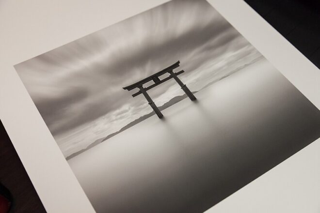
Printing…you want it darker
Because your monitor is a backlit LED screen and prints reflect light, a monitor will always appear brighter. For this reason, most printers will set their monitor brightness even a tad lower (see previous monitor calibration note) to get a better idea of print expectations.
I have had students ask if there needs to be a different edit for a print versus a web-based image, and I do not believe there needs to be. As mentioned, many underexpose when processing, so a correction on a print edit should also be a correction to web edit.